Accessibility
As the creator of products that sell into diverse industries, including government, the need for inclusive and accessible experiences is paramount. Paying attention to universal design principles in our design process sends an important message to our potential customers and partners that we comply with regulations.
To put this issue in perspective, statistics show:
- 9.1% of adults have some kind of vision trouble [Source: Disability and Functioning, CDC]
- 8% of men and 0.5% of women are color blind [Source: Color Blind Awareness]
- 16.8% of adults have hearing trouble [Source: Disability and Functioning, CDC]
- 15.1% of adults live with physical functioning difficulty [Source: Disability and Functioning, CDC]
- 4.4% of adults have cognitive disabilities [Source: 2016 Disability Statistics Annual Report (PDF)]
Built-in Inclusivity
Using Bolt's re-usable components to improve accessibility and consistency when building Pega Digital Experiences.
- Accessible markup is already included in the code.
- Since the code exists in a single component that gets reused, it’s easier to update and fix bugs
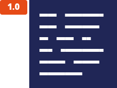
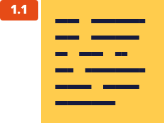
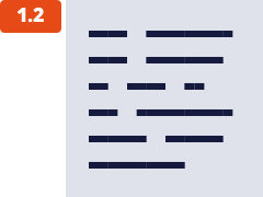
Color contrast | WCAG AA standards
All type/color combinations in Bolt must pass WCAG AA standards of 4.5:1 for normal text and 3:1 for large text. For larger text, if the font weight is light (300) or normal (400) the text should be no smaller than 24px. If the font weight is Semi-Bold (600) then the large text should be no smaller than 19px.
Do
Minimal contrast ratio: 4.5
 |
 |
|---|---|
| 1.0 White on Indigo | 1.1 Indigo on Yellow |
 |
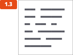 |
| 1.2 Indigo on Gray | 1.3 Dark on White |
Don’t
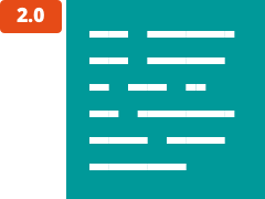
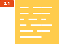
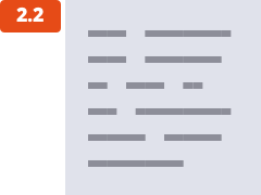
WCAG Fail
 |
 |
|---|---|
| 2.0 White on Teal | 2.1 White on Yellow |
 |
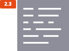 |
| 2.2 Dark on Gray | 2.3 White on Dark |